
How it works
The chart follows the question. Comparison across categories suits bars, change over time suits lines, and relationships between two numeric variables suit scatter.
State the question first, then pick the form that answers it directly.
Common error
Choosing a chart because it looks impressive rather than because it answers the question.
Worked example
Example
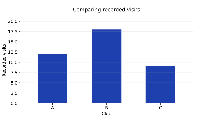
Categories: club A, club B, club C
Visit counts: 12, 18, 9
Question: compare counts across clubs
Choice: labeled bar chart
A bar chart compares distinct categories. A line chart usually represents an ordered progression such as time, while a scatter plot examines paired numeric observations. The chart should answer the stated question without inventing an ordering or relationship.
Exercises
7.1.1 · Explain
Choose chart types for weekly attendance, score distributions, and height versus arm span.
Show solution
A line chart fits ordered weekly attendance, a histogram can show score distribution, and a scatter plot can show paired height and arm-span measurements.
7.1.2 · Explain
Why should club names not usually be connected with a line suggesting continuous interpolation?
Show solution
The categories are distinct and have no defined intermediate numeric positions. A connecting line can imply continuity or an ordering that the data do not support.