
How it works
Presentation choices carry claims. Aggregating away variation, hiding sample sizes, or picking a flattering range are all arguments made silently.
Show the spread, not just the average, and report how many observations each summary rests on.
Common error
Reporting a mean for a tiny group beside one for a large group without noting the difference.
Worked example
Example
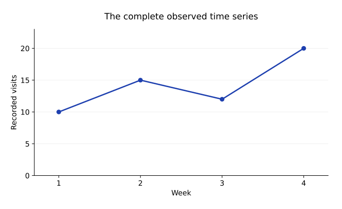
Week: 1, 2, 3, 4
Visits: 10, 15, 12, 20
Do not omit week 3 merely because it interrupts the rise
Publish the full observed series
Honest presentation preserves relevant observations and distinguishes measured results from inference. A chart can show association or change without establishing the cause of that pattern.
Exercises
7.3.1 · Explain
Why does a chart showing more study time with higher scores not alone prove study time caused the score difference?
Show solution
Other factors or selection effects may explain part of the association. A causal conclusion needs an appropriate study design and additional reasoning.
7.3.2 · Explain
How should a report handle a legitimate outlier?
Show solution
Investigate its origin, apply a documented rule consistent with the goal, and disclose any exclusion. Removing it only to improve the desired story is misleading.