
How it works
A visualisation needs a sentence saying what the reader should take from it, and a good one states the limits as well as the finding.
Write one sentence of finding and one of caveat beside every chart you present.
Common error
Presenting a correlation with language that implies causation.
Worked example
Example
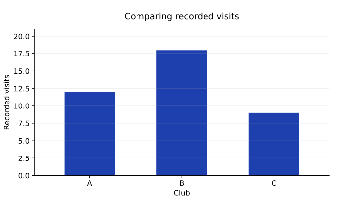
Club A: 12 visits
Club B: 18 visits
Club C: 9 visits
Observed period: one week
Records count visits, not unique people
A clear conclusion states the finding, the measurement unit, and the important limitation. Here B has the most recorded visits, but the data do not show that it has the most unique visitors or explain why it leads.
Exercises
7.4.1 · Explain
Write one supported conclusion and one unsupported claim from the displayed data.
Show solution
Supported: club B recorded the most visits during the observed week. Unsupported: club B necessarily has the most distinct members or is preferred by all students.
7.4.2 · Explain
What additional information would help compare participation fairly across clubs of different sizes?
Show solution
Collect appropriate membership counts or unique-participant measures, define the time period, and consider a rate per eligible person while documenting missing or repeated records.