
How it works
A chart without labelled axes and units is not interpretable. A truncated axis exaggerates differences and must be disclosed.
Label both axes with units, and start a bar chart axis at zero unless there is a stated reason not to.
Common error
A truncated axis making a small difference look dramatic, which misleads even when unintended.
Worked example
Example
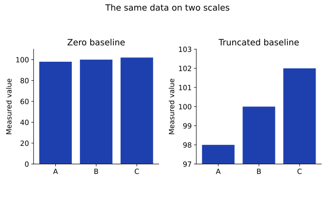
Measurements: 98, 100, 102
Chart A vertical range: 0 to 110
Chart B vertical range: 97 to 103
Both show the same numbers
Axis scale changes the visual impression without changing the underlying values. Label quantities and units, disclose truncation, and choose a scale suited to the comparison. Bar charts generally need a zero baseline for honest length comparisons.
Exercises
7.2.1 · Explain
What labels belong on a plot of time in seconds versus distance in meters?
Show solution
Label the horizontal axis time (seconds), the vertical axis distance (meters), and give a title or caption identifying the measured activity.
7.2.2 · Explain
Why can a bar chart starting at 97 exaggerate the relative difference between 98 and 102?
Show solution
Bar lengths would represent 1 and 5 rather than the actual magnitudes, making a small relative difference appear much larger. Use an appropriate zero baseline or another clearly explained design.